|
| Grapher - Graph Types Available |
 |
| Display your data as one of more than 40 different graph types in Grapher 7. Combine multiple graph types to present your data in a completely new way! Alter any property of any of the graph types to create compelling new graphs. |
| |
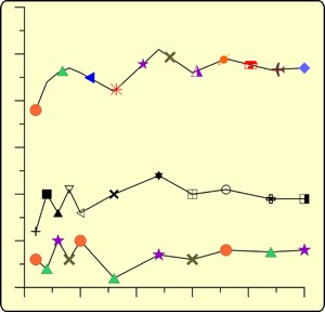
| Line and Scatter plots display data as a line or as symbols. Combine line and symbols or use only the line or only symbols. Display the data as a traditional 2D line/scatter graph. |
| |
Create line plots with plotted symbols, comments, and fit curves |
| |
| Class scatter plots allow symbols to be based on a range of data values in a worksheet column. In addition to class scatter plots, regular symbol plots can be created with different symbols based on information in a column or in a symbol table. |
| |
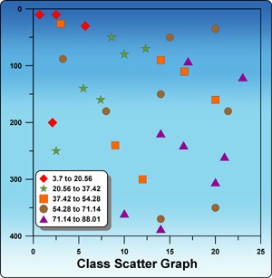
Class scatter plots put the data into groups or "classes" based on values in a worksheet column. |
Scatter plots can also use varying repeating symbols, or different symbols for each point. |
|
| |
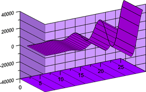
| Ribbon/wall plots are similar to line plots, but are shown with a 3D aspect! 3D Line/Scatter plots are used to display the location of points with three variables. Display the data as lines, symbols or as lines and symbols. Add wall projections, drop lines, or labels to emphasis data on your graph! |
| |
Ribbon/wall plots can be customized with comments, fit curves, error bars, and legends. . |
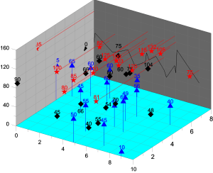
Display lines or symbols in three dimensions with the 3D XYZ Plot. Add drop lines or wall projections! |
|
| |
| Step Plots display data as vertical and horizontal lines. Display your step plot as either 2D or 3D. |
| |
 |
 |
| Create step plots with horizontal or vertical lines in 2D or 3D |
|
| |
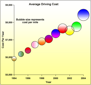
| Bubble Plots display data with varying sized symbols. The size of the symbol is dependent on a third variable. Change the bubble to any symbol! Use a 2D bubble plot that displays three variables or a 3D bubble plot that shows the change in four variables. Use solid colors, gradient fill colors, multiple fill colors, or any combination of color choices to fill your bubble plots! |
| |
 |
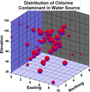 |
| Create bubble plots to show how one extra variable relates to the normal XY or XYZ variables. Display in two or three dimensions! |
|
| |
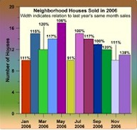
| Bar Charts display data as adjacent or stacked bars. Choose to have vertical or horizontal bars. Bar charts can be displayed as 2D or 3D! Use multiple colors, gradient fill colors, or a combination of color choices for bar charts. Display labels at the top of bars, at the bottom of bars, or in both locations. Add error bars directly to your bar charts. |
| |
 |
 |
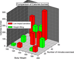 |
| Create bar charts with horizontal or vertical bars. |
|
| |
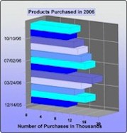
| Floating Bar Charts display the difference between two variables. Choose to have vertical or horizontal bars. Choose between 2D and 3D floating bar charts! |
| |
 |
 |
 |
| Floating bar charts can be displayed with multiple colored variables in either vertical or horizontal orientation. |
|
| |
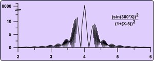
| Function Plots display mathematical functions. Plot Y as a function of X, or plot a parametric equation where X and Y are a function of a third variable, T. Function plots can be shown in a 2D or 3D orientation. |
| |
 |
 |
| Specify a function or equation to create a graph. Position the axes anywhere on the page. Break axes to reveal interesting trends in your data. |
|
| |
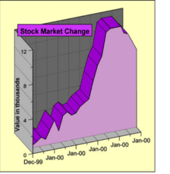
| Hi-Low-Close Graphs display a range of Y values at each X value. These plots are commonly used to display the high, low, opening and closing of stock values, though Hi-Low-Close graphs are also used for many other purposes. Hi-low-close graphs can be displayed with the standard line or with bars, the "candlestick" graph. |
| |
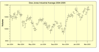
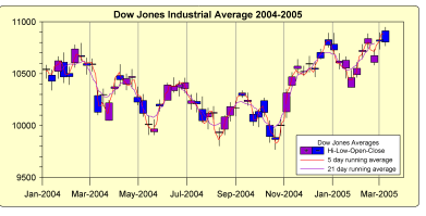
Track stock performance with the High-Low-Close Graph. Overlay a
best-fit curve to predict future performance. Display as a candlestick
plot for even faster one-look analysis. |
| |
| Polar Graphs display degree, radian or grad data versus a radial distance. The degree, radian or grad data are displayed on a circular angle axis. The second axis is a radial axis showing the distance from the center of the circle. Polar plots can display mathematical functions, data, bars, or classed scatter plots. Display in degree, radian, or grad data. |
| |
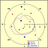
Angle axes can display text for labels. Combine multiple polar plots in a single graph. |
Similar to XY bar charts, polar bar charts allow comparison of multiple bars on the angular axis. |
Polar function plots display curves using mathematical functions. |
|
| |
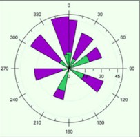
| Rose Diagrams display degree, radian or grad data versus a radial axis. Like histograms, Rose Diagrams display statistical data, showing the number of occurrences of an event that fall within a specific angular region. Bins are fully customizable in rose diagrams! |
| |
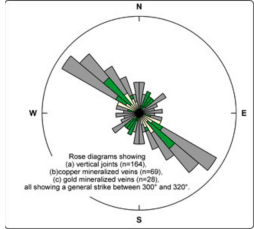
Rose diagrams can display statistical information similar to histograms. |
| |
| Wind Charts graph frequency vs. wind direction. Bins are created according to the wind speed. The frequency can be viewed as counts, relative frequency, or as percentages of relative frequency. Bins are fully customizable! |
| |
Class scatter plots put the data into groups or "classes" based on values in a worksheet column. |
Scatter plots can also use varying repeating symbols, or different symbols for each point. |
|
| |
| Class scatter plots allow symbols to be based on a range of data values in a worksheet column. In addition to class scatter plots, regular symbol plots can be created with different symbols based on information in a column or in a symbol table. |
| |

Wind charts can show wind direction binned by speed. |
| |
| Pie Charts show data as proportional slices of a circle. Each data value is divided by the sum of the data to determine the size of the slice. Display pie charts in 2D or 3D! Explode slices to emphasis a particular item! |
| |
 |
 |
| Display the pie together or explode a slice. On a Pie Chart, choose how to label each slice. |
|
| |
| Stiff diagrams can be used to display water quality. Stiff diagrams show relative concentrations of multiple cations and anions. |
| |
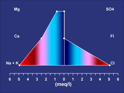
Stiff plots can be color filled to aid in the interpretation of the graph. |
| |
| Ternary diagrams show the relative proportions of three variables on three axes. Choose to show the relative proportions as percentages or as fractions. Add lines to connect the points on the ternary diagram! Display any column for the labels or show relative proportions for labels! |
| |
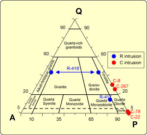
Display the Ternary Diagram with or without labels. Add lines between the points to show trends. |
| |
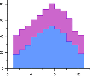
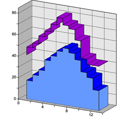
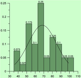
| Histograms display data separated into groups or bins. Add labels, a Gaussian fit, and display the Y axis as relative frequency to change the display of this graph. Display histograms as either 2D or 3D! |
| |
 |
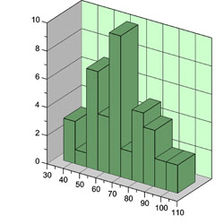 |
| Display statistical information on a Histogram Graph. Set the number and size of bins. |
|
| |
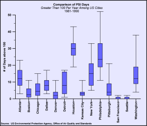
| Box-Whisker plots are commonly used to show the min, max, median, and lower and upper quartiles for a particular group. The caps at the end of each box indicate the extreme values (min and max). |
| |
 |
| |
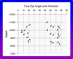
| Vector plots are used to show the starting and ending point of a variable, such as wind or current. Grapher allows you to set the starting XY position. The ending position can be specified with angle and magnitude or ending XY position. |
| |
 |
| |
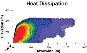
| Contour plots are a 2D representation of 3D data. Contour maps may either be situation on the XY plane or the XZ plane. Maps can be generated from data files or Surfer® grid files. Choose from either a default color fill or set your own color fills! |
| |
 |
| |
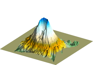
| Surface maps use shading and color to emphasize your data features. Surface maps can be combined with any other 3D map type, to create the exact graph you desire! |
| |
 |
| |
|